




The Three-Color Rule in Home Decor: How to Balance Colors Like a Pro

Unlock the Designer Secret to a Perfectly Balanced Room
Have you ever walked into a room and instantly felt a sense of calm and visual harmony, but couldn't quite figure out why? Or perhaps you've tried decorating a room yourself, only to feel that the colors look chaotic, flat, or just plain wrong. The secret isn't luck—it is a classic design principle known as the 60-30-10 rule.
This simple mathematical ratio is the key to balancing colors like a seasoned interior decorator. By dividing your room's color palette into three distinct percentages, you can create a space that feels cohesive, layered, and visually exciting.
What is the 60-30-10 Rule?
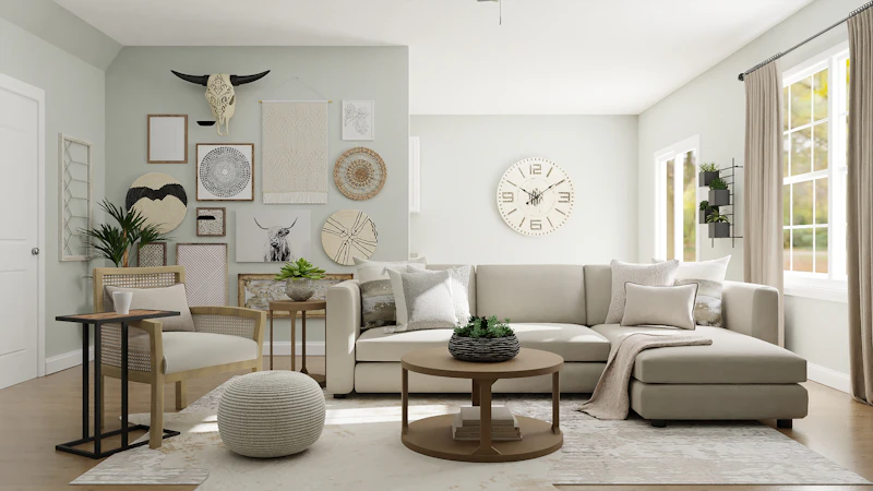
The 60-30-10 rule is a guide used by interior designers to build a balanced color scheme. It breaks down the color distribution in a space as follows:
- 60% Dominant Color: This is your base color, which sets the overall tone of the room. It is typically used on the walls, large area rugs, and largest furniture pieces like sofas.
- 30% Secondary Color: This color adds depth and supports the dominant color. It should be distinct enough to create interest but not compete with the base. Think curtains, accent chairs, and smaller furniture.
- 10% Accent Color: This is your splash of personality. Used sparingly, it draws the eye and makes the room pop. You will use it for throw pillows, art pieces, candles, and decorative accessories.
Step 1: Choose Your 60% Dominant Base
Because the dominant color covers most of your room, it is safest to choose a neutral or soft shade. Warm beiges, soft greys, cream, or muted sand tones are excellent choices. They make the room feel spacious and clean, providing a perfect backdrop for the rest of your decor.
If you are feeling brave, you can use a dark hue like navy blue or charcoal grey, but remember that this will make the room feel much cozier and darker.
Step 2: Layer in Your 30% Secondary Shade
Your secondary color should complement the dominant shade while providing a clear contrast. For example, if your base is a warm cream (60%), a soft olive green or a dusty blue (30%) works beautifully for curtains and accent chairs. It breaks up the monotony of the neutral background and gives the room character.

Step 3: Pop with Your 10% Accent
This is where the fun begins. The accent color is your opportunity to introduce a vibrant hue that you love. Think burnt orange, mustard yellow, or deep terracotta. Because it only makes up 10% of the room, it won't overwhelm the space, but it will make it feel curated and professionally styled.
Common Mistakes to Avoid
- ❌ Splitting the room 50-50: Using two colors in equal amounts creates a visual battleground where the eye doesn't know where to look. Always ensure one color is clearly dominant.
- ❌ Overusing the accent color: It can be tempting to add "just one more" pillow, but too much accent color dilutes its power. Keep it strictly to small accessories.
- ❌ Forgetting texture: If you use a monochromatic palette (e.g., all warm neutrals), you must use varied textures (linen, wood, brass, bouclé) to act as your 30% and 10% layers.
Frequently Asked Questions
Can I use a fourth color?
Yes! You can break it down into 60-30-5-5. Splitting the accent color into two different shades is a great way to add extra layers, just make sure they harmonize.
Does this rule apply to small rooms?
Absolutely. In fact, it is even more important in small spaces to keep visual clutter to a minimum and ensure the room feels organized.
Can wood count as a color?
Yes, natural wood finishes (like oak, walnut, or teak) carry strong warm undertones and should be counted as part of your 30% or 10% color layers.
Shop Our Curated Decor Essentials
Ready to transform your space? Try mapping out your current room's color percentages and see where you can make adjustments. Happy decorating!

